Hochtief
Brief
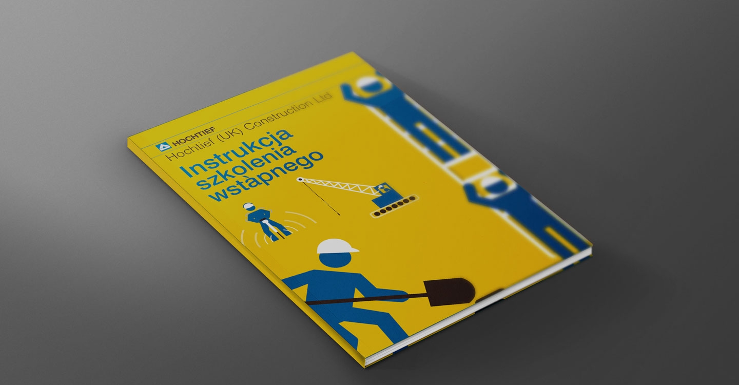
To design a booklet to promote health and safety practices across Hochtief’s many construction sites. Booklet needed to be small enough to carry around in a pocket and the information clear, accessible and easily translatable into different languages.
Solution
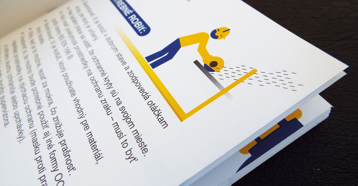
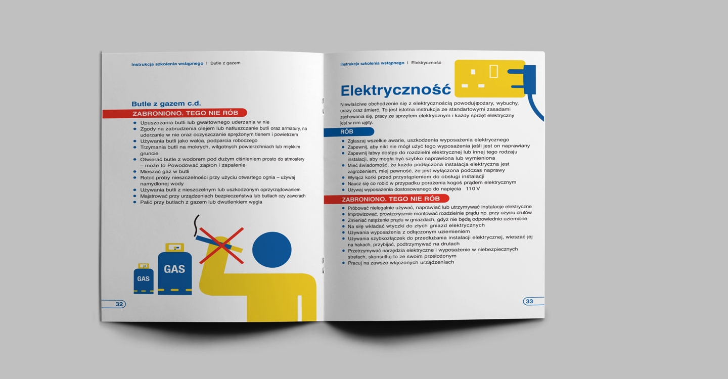
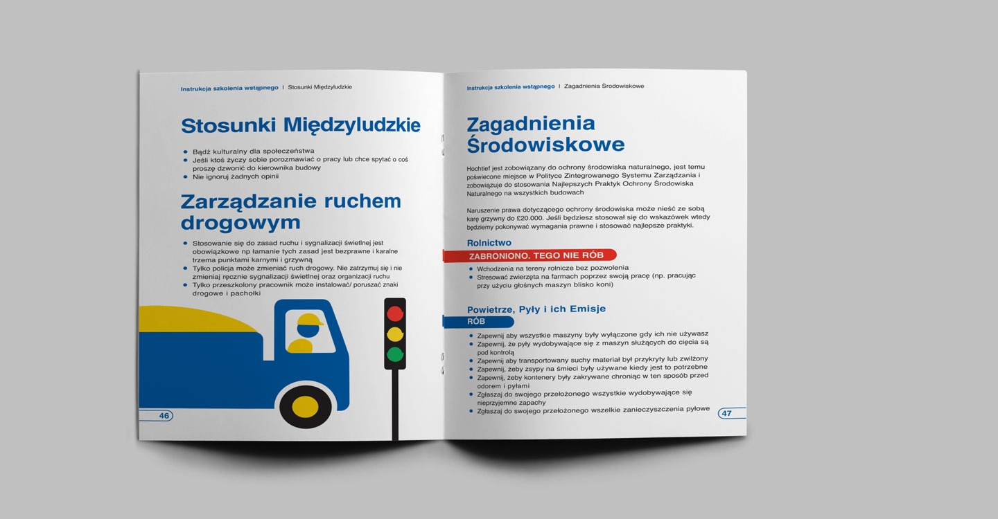
A design inspired by road sign characters. Illustrations were all drawn by myself and a colleague, and different versions were produced in different languages. The Polish version is shown.
Media
Brochure | exhibition graphics
Software
Indesign | Photoshop


